Restaurant & Dining
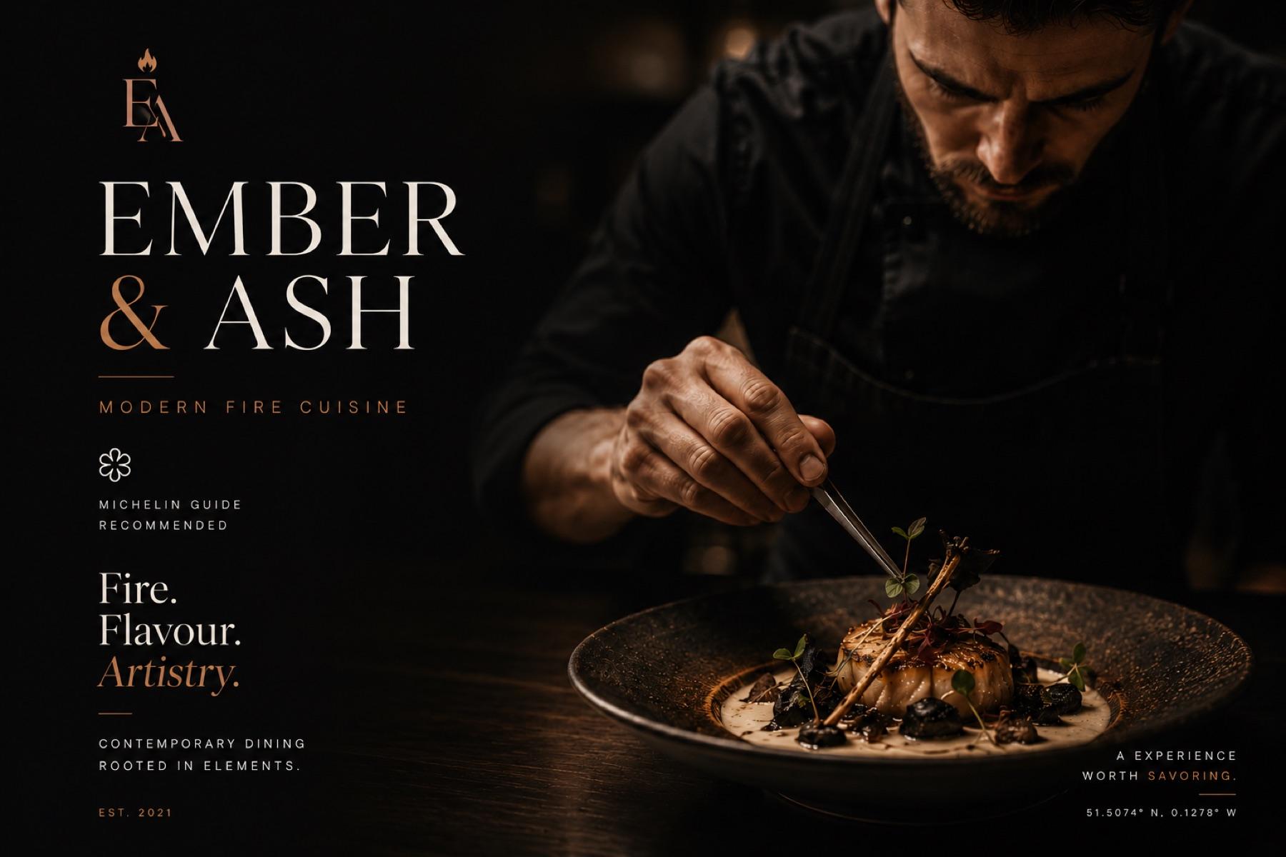
Ember & Ash
A fire-cuisine restaurant brand designed around the two things that actually convert: the menu and the booking button.
Studio concept — a brand we invented, designed and produced ourselves.
- Industry
- Restaurant & Dining
- Services
- Brand IdentityWeb DesignMotion Content
- Timeline
- 3 Weeks
- Platform
- NetlifyOpenTable IntegrationCustom CSS
The challenge
Restaurant websites are either too minimal or too cluttered. Ember & Ash needed something atmospheric, warm, and instantly bookable.
The solution
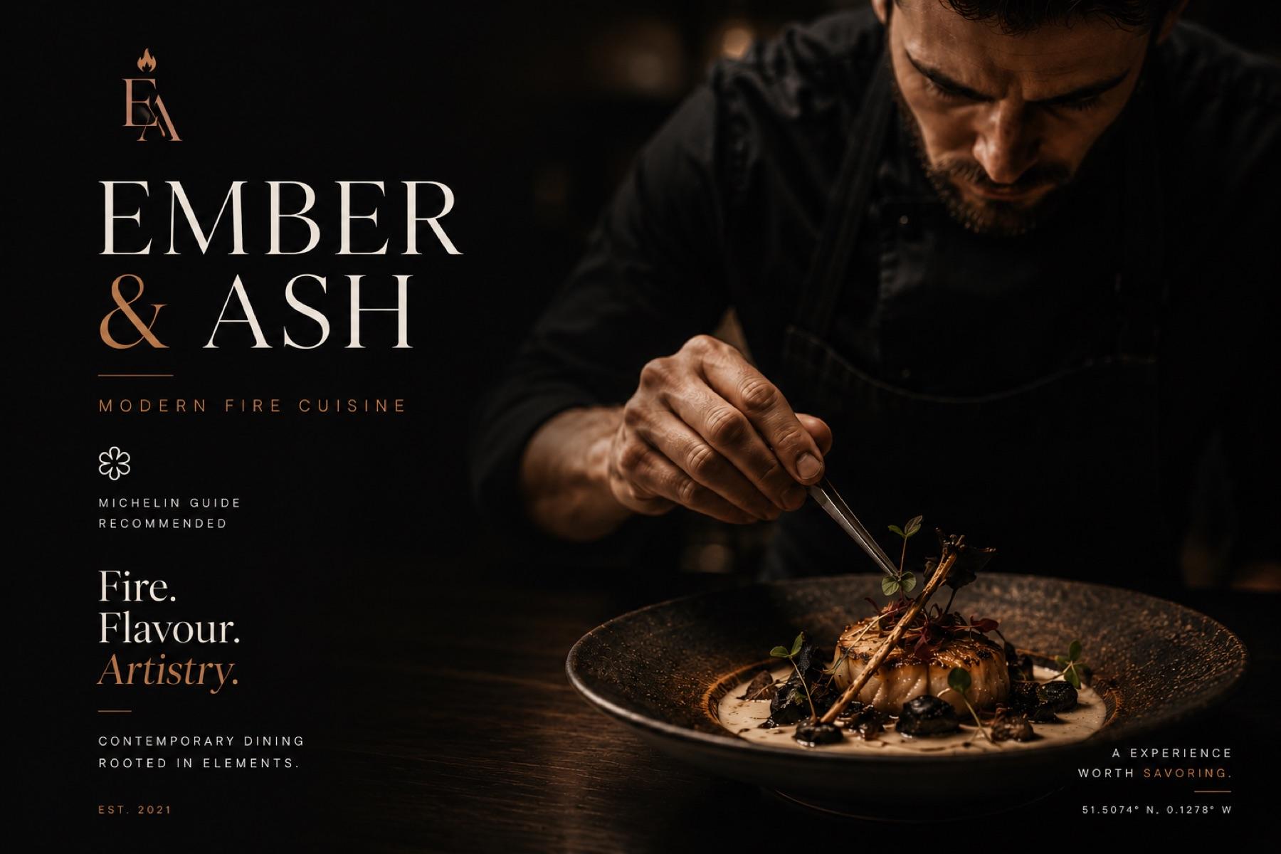
We created a full sensory brand experience — warm photography direction, editorial typography, an animated hero that evokes fire and atmosphere, and a frictionless reservation flow that doubled their online booking rate.
The brief
Restaurant sites bury the two things every visitor came for. The brief was to design around that behaviour instead of fighting it, while still earning the price point visually.
The outcome
Our hospitality reference — and the clearest example of designing for a real context rather than a desktop mockup.
- 01
Put the menu and the reservation CTA within one interaction of every scroll position.
- 02
Built a warm ember palette that holds up on a phone in a dim room — the actual condition the site gets viewed in.
- 03
Cut short-form motion of the plating to carry the brand onto social without commissioning a separate shoot.