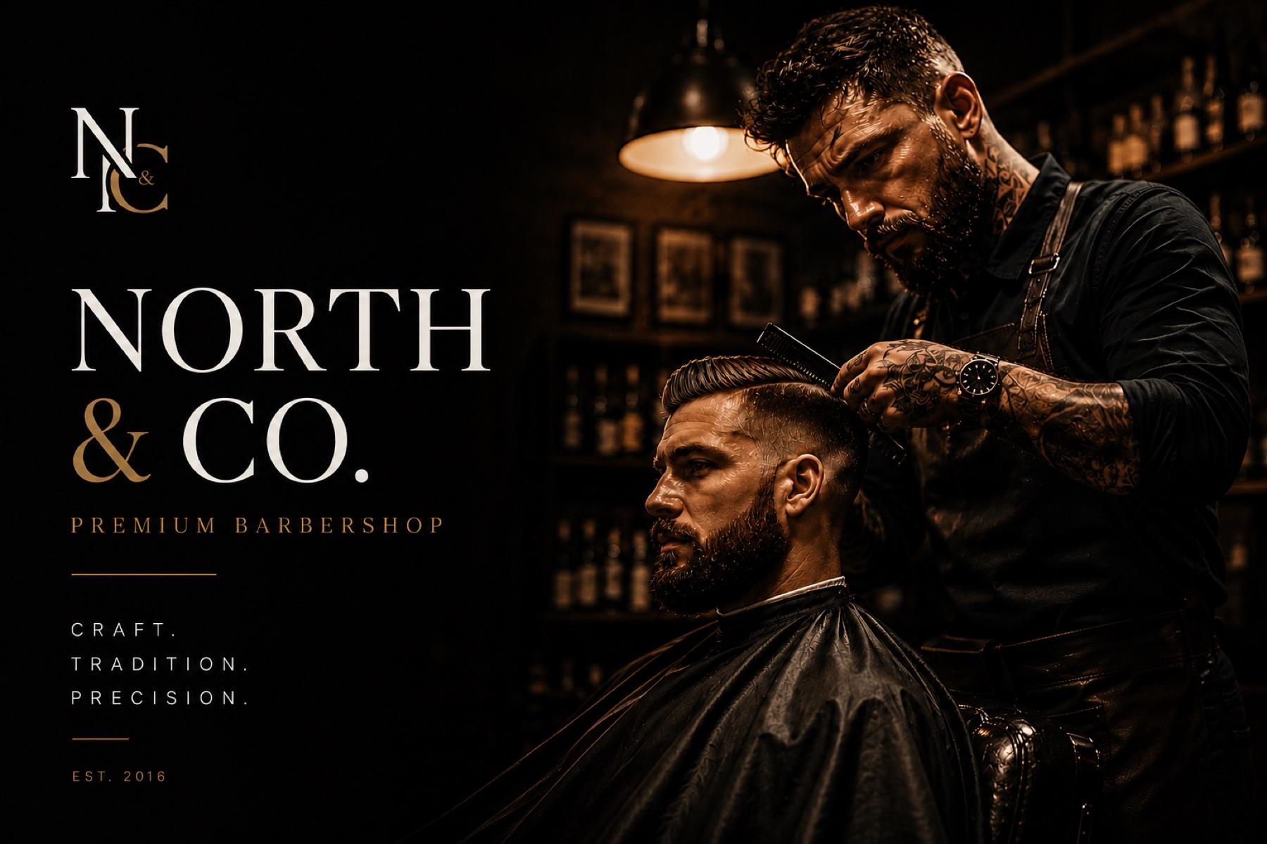
Premium Barbershop
North & Co.
A barbershop identity built on serif restraint instead of the category's default neon, skulls and chrome.
Studio concept — a brand we invented, designed and produced ourselves.
- Industry
- Premium Barbershop
- Services
- Brand IdentityWeb DesignBooking Flow
- Timeline
- 2 Weeks
- Platform
- NetlifyCustom HTML/CSSCalendly Integration
The challenge
Every barbershop website looks the same — black background, scissors icon, basic booking form. North & Co. wanted something that felt premium without feeling pretentious.
The solution
We stripped it back to the essentials: a powerful hero, clear service menu, instant booking, and a visual language that felt like the shop itself. Fast, sharp, and built to convert walk-ins from Google.
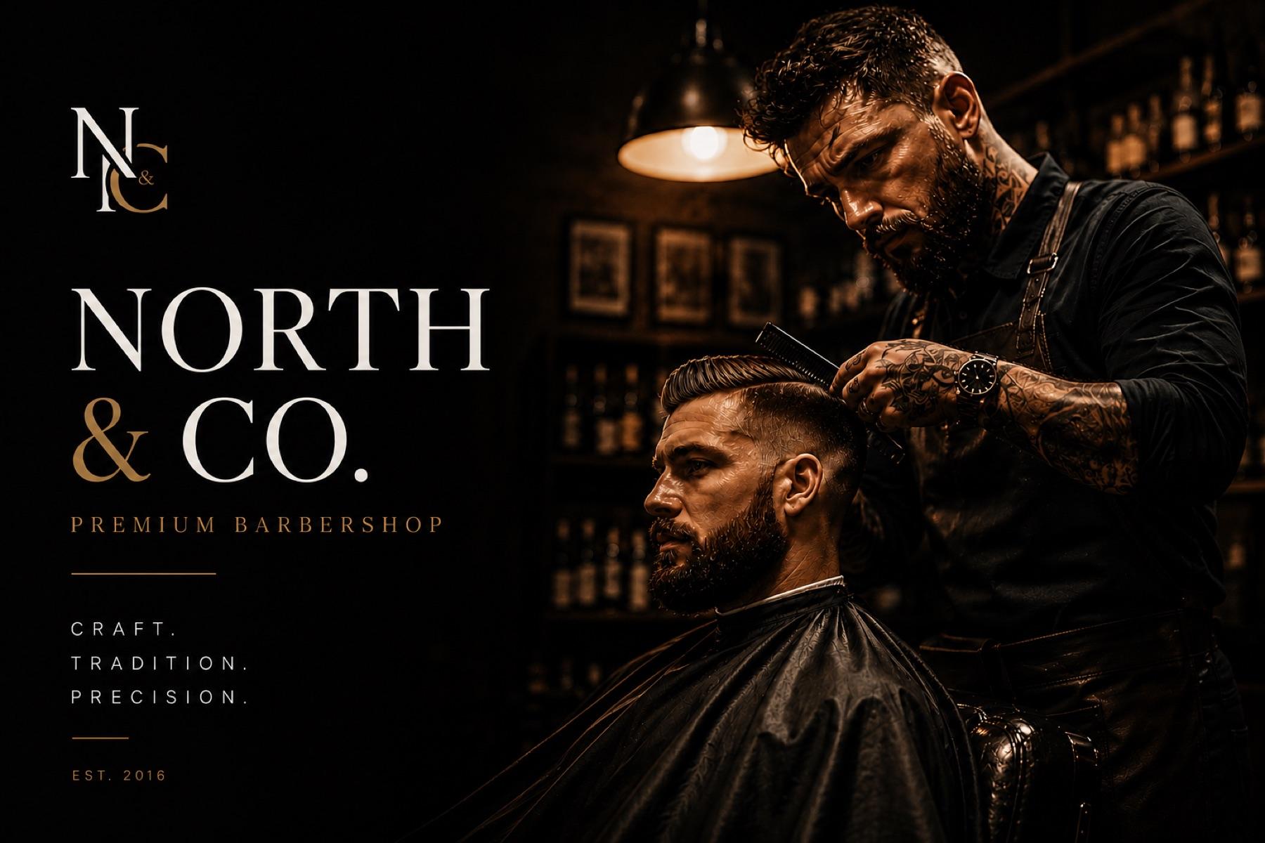
The brief
Barbershop branding has converged on one look: black, gold, aggressive. We wanted to find out what the category looks like treated as a heritage craft instead of a lifestyle statement.
The outcome
The clearest proof in our portfolio that restraint outperforms decoration in a crowded local category.
- 01
Anchored the identity in a wide-tracked serif wordmark — closer to a tailor than a tattoo parlour.
- 02
Designed a booking flow that answers the only three questions a customer actually has: who cuts, when, and how much.
- 03
Built the page around a single full-bleed hero so the craft does the selling, not the copy.