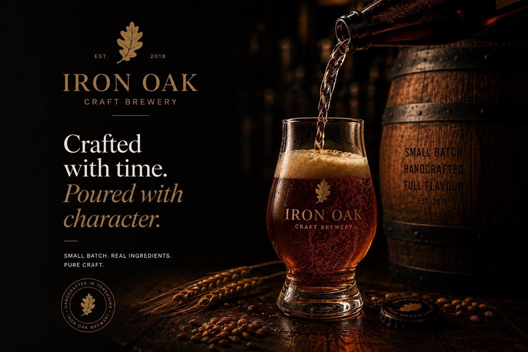
Craft Brewery
Iron Oak
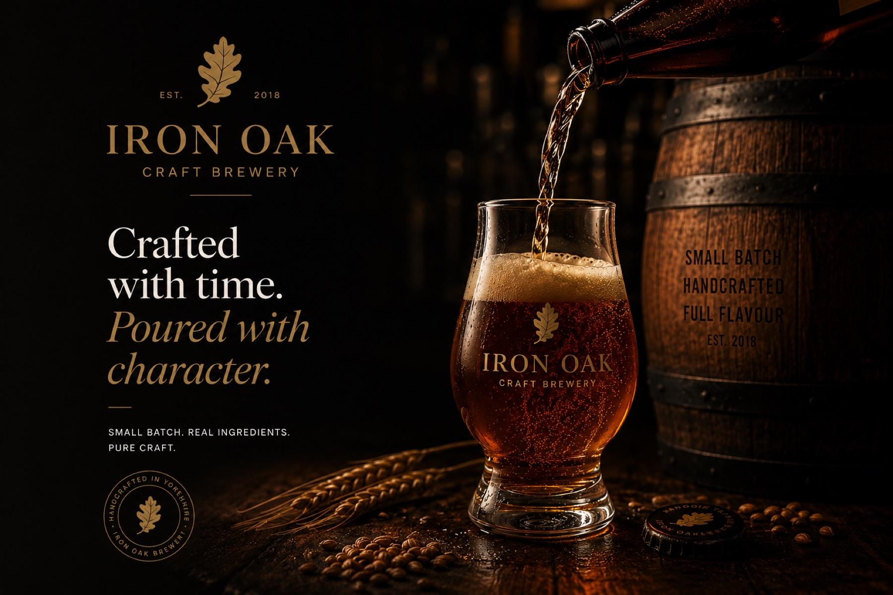
A small-batch brewery identity built on a single oak-leaf mark that works on a pump clip, a bottle cap and a glass.
Studio concept — a brand we invented, designed and produced ourselves.
- Industry
- Craft Brewery
- Services
- Brand IdentityPackagingArt Direction
- Timeline
- 4 Weeks
- Platform
- ShopifyCustom ThemeStripe Payments
The challenge
Iron Oak were launching into a competitive craft beer market with no brand identity, no packaging, and no online presence. They needed everything from scratch — fast.
The solution
We built a complete brand world: logo, colour system, typography, and can label designs for their first four ales — then launched a Shopify store for direct-to-consumer sales.
The brief
Craft beer branding usually shouts — loud illustration, louder names. We wanted to see what the category looks like when it borrows from whisky instead: patient, warm, and quietly confident.
The outcome
Our reference for any food, drink or maker brand where the product photographs better than it describes.
- 01
Built the system around one oak-leaf mark that survives at every scale a brewery needs, from bottle cap to bar frontage.
- 02
Set the identity in a classical serif with a gold-on-black palette that reads well in the dim light of an actual pub.
- 03
Art-directed the imagery around the pour — the single moment that sells the product better than any copy line.